
Carrying Branding Through a Project
- Alex McDougall
- Nov 11, 2023
- 3 min read

In my previous blog, I talked on the impacts of branding and storytelling. But what happens when we introduce a project where the world building and story is different or changes often? Through my previous experience as a poster designer, I discovered what branding elements can tie a poster series together while each poster tells their own story.
The Xchange
In 2022 I was a co producer for a series of drag shows along with drag performer Mya Fox called the Xchange. I was in charge of creating the posters for the show run. In total we did 4 shows each with a different theme and story told through its poster. It was our chance to have fun and create impactful images that drew in audiences.
I had to make each poster unique but still recognizable as part of the same series of events for the audience. We knew the title would be the same but how we presented it changed with every show and poster design.
We set out with these framework approaches for each poster. Where the images or themes may change, these elements stayed the same. These included:
· Show title
· Fonts
· Similar layouts in design.
· Photos of the hosts X and Mya
With every poster, the font for informational text like the date, cast and address would remain the same font on each poster. The title, venue name, and other text would change on each poster to match the story and visuals.
Xchange 001
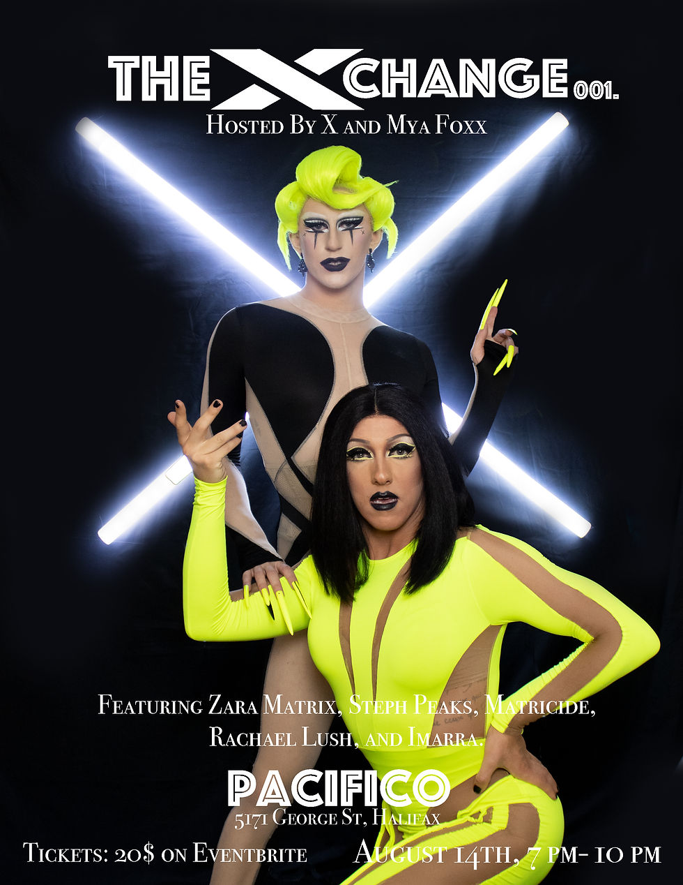
For our first show we wanted to launch with a striking futuristic black and neon colour scheme. For 001 we went with a text that called back to the art deco design elements within the venue but still fit with the futuristic costumes and visuals of the rest of the poster.
Xchange 002
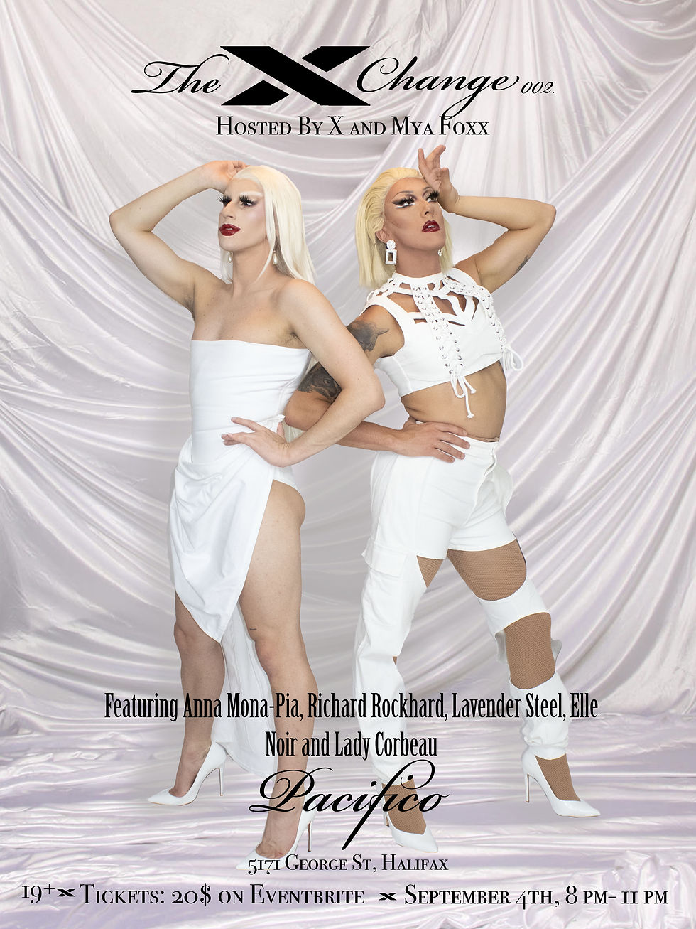
For our second show we wanted something softer and more delicate compared to our first show. We went with a more heavenly and pure theme for this show poster. We went with an all white visual with a drapery back ground. For text, we kept our same informational font but for our accent font we went with a more delicate cursive. We went with a black font to stand out against all the white.
Xchange 003
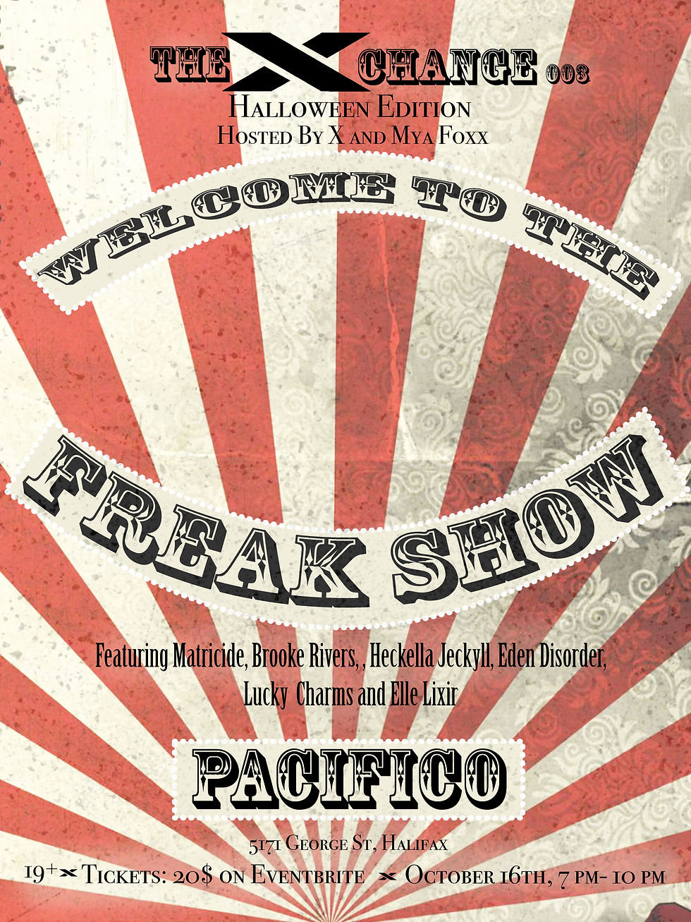
003 was our Halloween event. We had little time to make this poster, so we couldn't take new pictures for it. This took out a key design element of Having X and Mya on each poster. This meant that the poster had to tell the story of the freak show theme with fewer creative elements but still keep within brand.
Like before we selected a text that fit the freakshow theme and picked an image that without a doubt read the theme. The traditional circus tent stripe pattern came to mind, but we edited it to look grudger to fit freak show. With all the elements together, we were able to still connect the poster to the overall arch of the show but we did notice a dip in ticket sales of this show compared to others.
Xchange 004
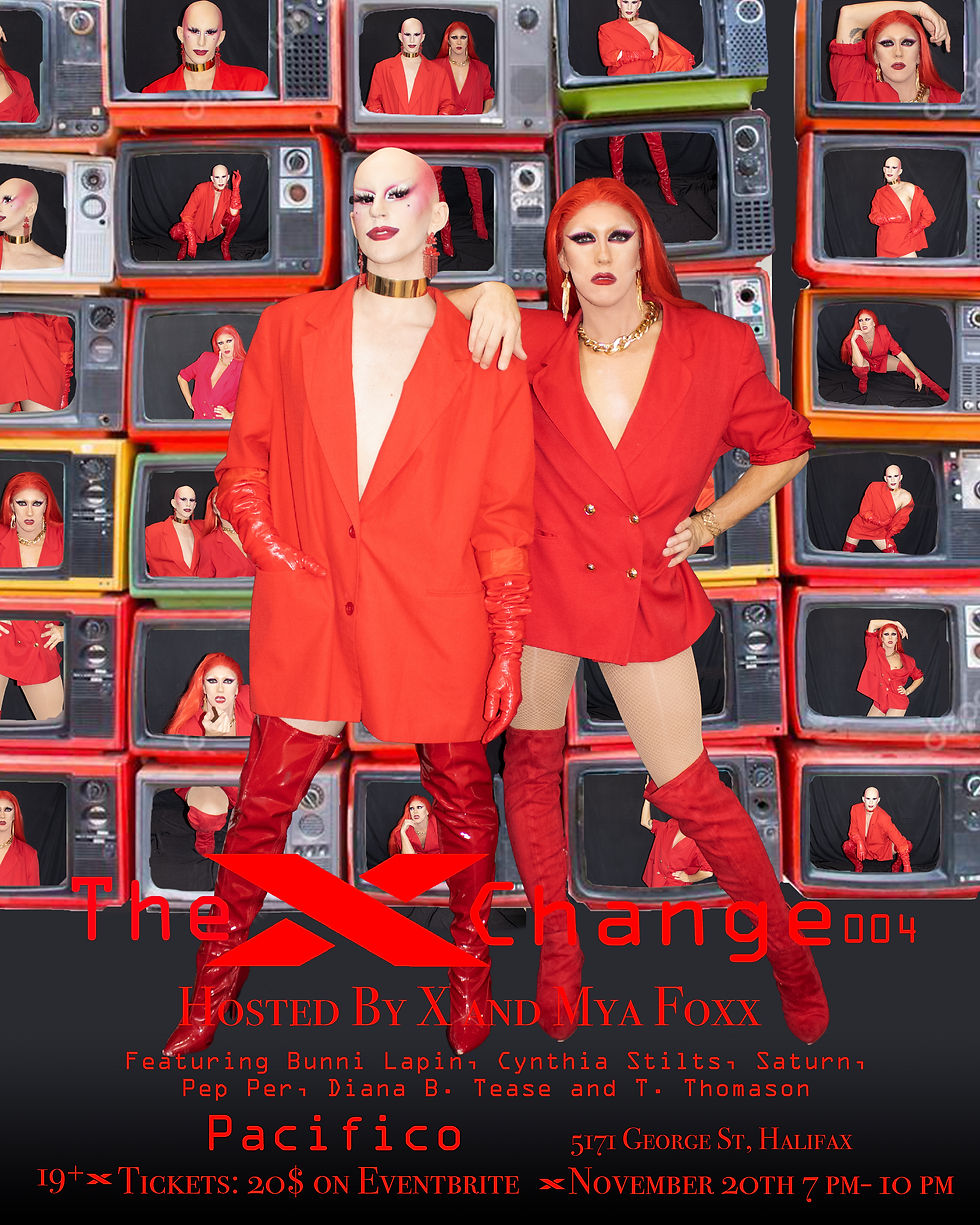
Lastly for our final show, we wanted to have a wall of screens with us in them creating a retro futuristic look. X and Mya were back to shoot for this poster so we were able to re introduce them as a key design element. Like the other posters we went with a different front this having a more technical look with red as our font colour.
Looking back
I was pleased with how we made unique and creative posters for each story while still maintaining a consistent brand. We were able to keep each poster original while stringing these elements through each:
· Same font for key information text
· Design elements like the X in Xchange
· Similar Layouts of design
· Having X and Mya featured with the exception of 003
With these core elements we were able to tell four different stories while maintaining the core branding across each.
Which poster design did you like the most? If you like to see other poster designs ive done check out my portfolio Here!
Comments